Tim Powell is the mastermind behind Fairground, with 35 years experience within the organic and natural foods industry. Since retiring, Tim had the idea of creating his own fruit and nut bar containing only ingredients that were certified both organic and fair trade, which is how Fairground came to be.

The brief was simple… to emphasise the two main points of organic and fair trade. The words ‘Fair and Ground’ were chosen to simply represent the brands main values. A mind mapping process was put into action to work out the connections of both the words and found that it filtered back to ‘fairly traded’ and naturally ground organic products.

A strategy needed to be put into place to make sure people understood the connection between the logo identity which transpired into the design campaign. Showing the bars growing from the grass roots implements the fact that this was a natural product and has all the connotations of being organic.

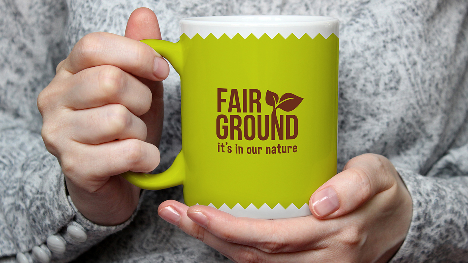
We not only designed the logo but also created the strapline ‘It’s in our nature’, which is simple, effective and ties in nicely with the brand identity.

Challenges regarding the amount of copy required to fit onto the packaging of the bar certainly wasn’t an easy task to deal with. The overall brand identity needed space to breathe and not over crowd and complicate the packaging design with too much copy. We also looked at out of house marketing material and represented how this would appear for the brand across different platforms, as well as creating tangible marketing material such as mugs.

Overall, Tim was very pleased with the branding of Fairground and we enjoyed our fair share of the bars themselves!
Get our most interesting news, promotions and events sent directly to your inbox.
